Event sales analytics - comparing the sales of two events in Coconut Tickets
How can you compare the sales of this year's event compared to last year? Coconut Tickets has been designed with special consideration for event organizers that run the same event multiple times (e.g. every year). The built-in analytics tool allows you to visualize the sales for your repeating events without needing to export data or use spreadsheets.
This tutorial will demonstrate how to display a chart for a single event and then how to compare sales between two occurrences of that same event.
For an introductory tutorial on how to use the analytics charting tools in Coconut Tickets please see this article.
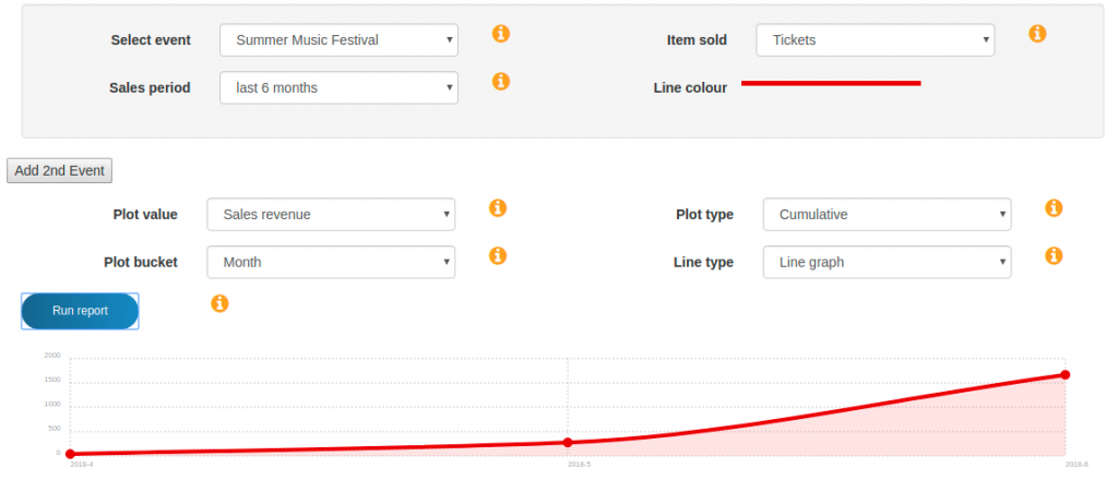
From the dashboard you can click on the "Total revenue" cell of the event you wish to display. Alternatively you can select the "Analytics" menu option from the dashboard menu and then manually select the event in the analytics tool. This will display one chart for the chosen event. For our example we have launched the analytics from the dashboard and increased the sales period from 3 months to 6 months. The screenshot below shows the 6 month sales graph that is displayed. The graph is of cumulative sales revenue over the last 6 months.
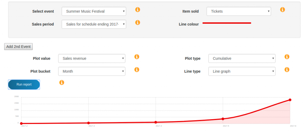
In order to make a comparison, we need to be able to show the same event for 2 different time periods. The easiest way to do this is to change from using absolute time periods (e.g. last 6 months) and instead to select the whole time period during which a particular occurrence of the event was on sale. When we look at the sales period options for this example event we can see that there is a 2017 time period and a 2018 time period corresponding to the particular years when this event took place. If we select the 2017 period and run the report again then we get a graph of sales revenue as shown in the screenshot below. Notice that Coconut Tickets has automatically identified the period of time during which these tickets were on sale and built the graph around it.
This is a good start but we still don't have a sales comparison between two different periods. To get the comparison we need to click on the "Add 2nd Event" button which then allows us to enter the details for the second event. We choose the name of the second event to be the same as the first, in our example this is the "Summer Music Festival" then we choose the sales period to select the next occurrence of this same event. In our example we select the 2018 occurrence of the event. Now we can run the report and, for our example, see a comparison between the event in 2017 and the same event in 2018. The screenshot below shows the two graphs together.
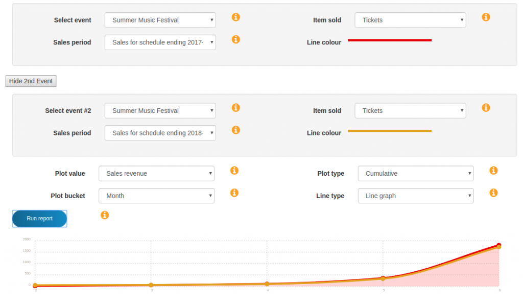
This time we can see two graphs being displayed at the same time. By looking at the input controls we can see that line colour for 2017 is red and the line colour for 2018 is yellow. Therefore we can conclude that sale revenue in 2018 was very similar until the final month when the 2018 sales slightly under performed 2017. Notice that the time axis no longer shows years but just month numbers for easy comparison.
Because the sales performance is quite close between these two years we may wish to change the type of chart to get another view of the comparison. To do this we can change the "line type" from "line graph" to "bar chart" and rerun the report. The resultant display is shown in the screenshot below.
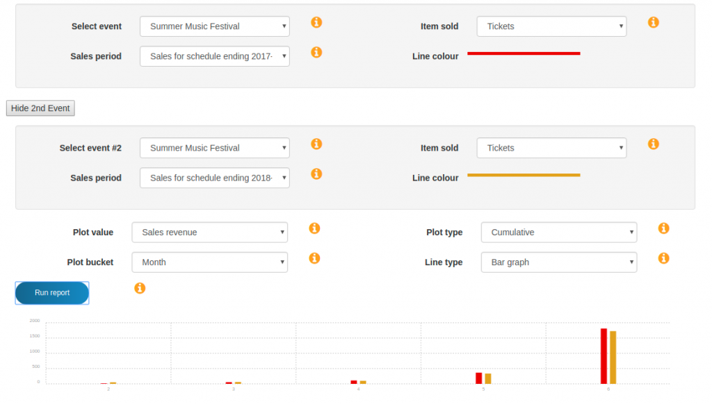
The bar chart makes it easier to see that sales started to differ in month 5. Notice that the characteristics of the graph are shared between both the events that we are visualizing. In this example, both graphs became bar charts.
These charts have shown cumulative (month on month) sales revenue. If we wanted to see exactly how many sales occurred in each month (not cumulative) then we can change the "plot type" from "cumulative" to "point". The resulting chart for this example is shown below.
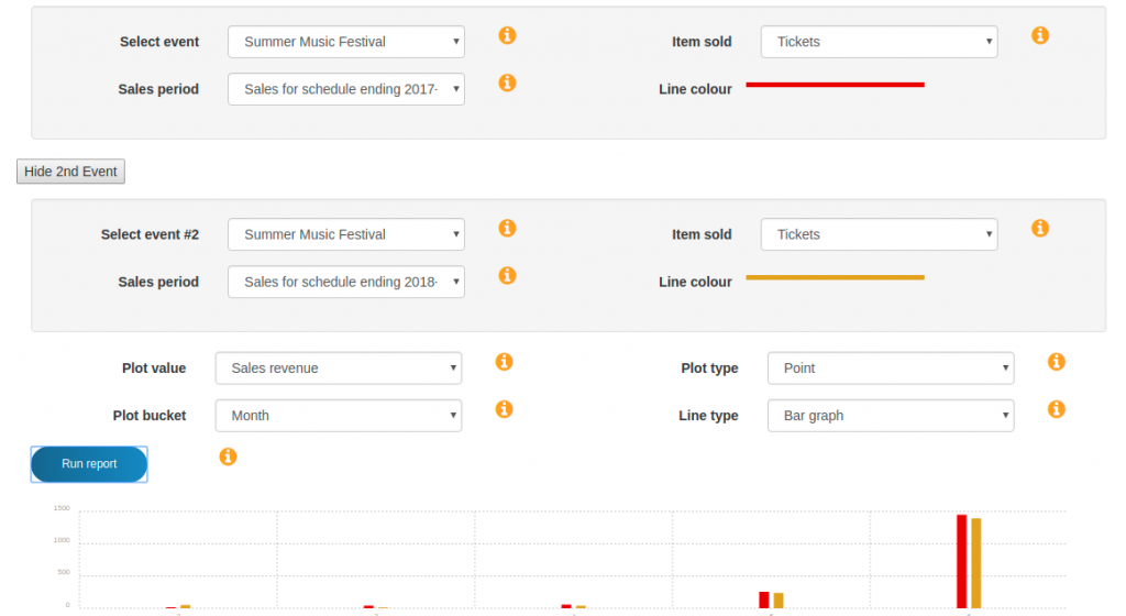
You will notice that the shape of the bar charts are very similar to the cumulative sales bar chart but the x-axis has changed. From this we can see in the last month of ticket sales both events sold almost 1500 tickets in addition to the tickets they had already sold in previous months.
To see this from another angle we can change the "plot value" from "sales revenue" to "#tickets sold" and run the report again.
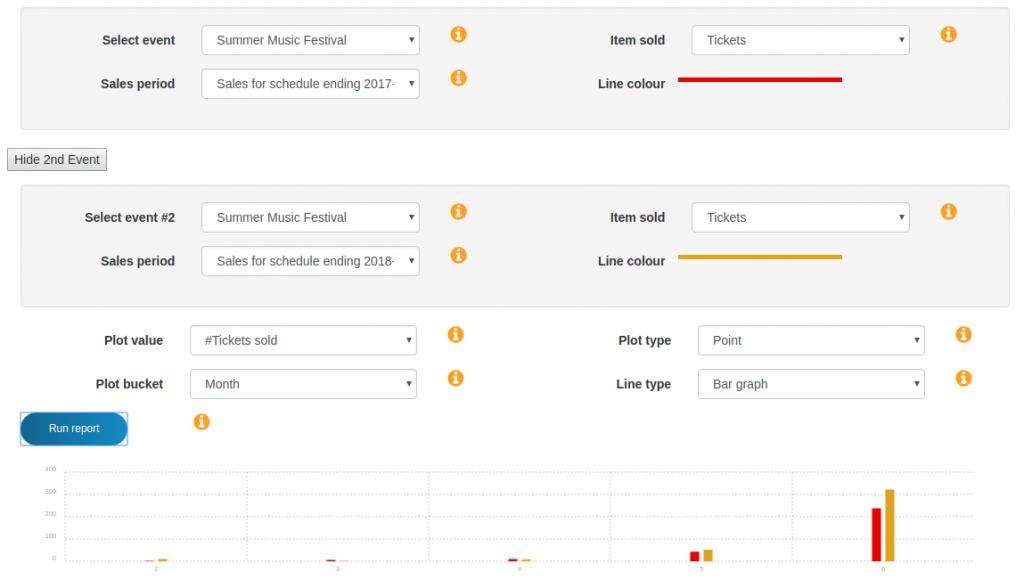
Interestingly, by looking at the tickets sold we can see that in 2018 we sold more tickets in the final month before the event than we did in 2017 but we know from the sales revenue charts that we received less ticket revenue in the same month in 2018 than in 2017. In this case the explanation is due to the number of discounted tickets sold in 2018 in the last week before the event.