Sales analytics and charts on Coconut Tickets
How do you know how your event sales unfolded? Even if your event lasts for only one day, the period of time during which your tickets were on sale will be a lot longer. As an event organizer you may want to look back at your sales history to see what happened and observe the success of your event advertising promotions had on your sales. You can see this directly in Coconut Tickets without any cumbersome exporting of data or use of spreadsheets.
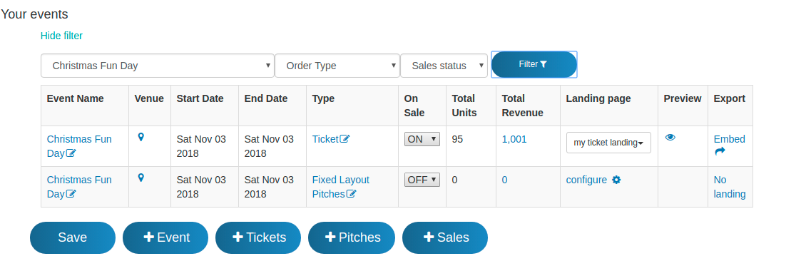
Sales Chart From The Dashboard
From the dashboard, to display a simple chart all you need to do is click on the "Total Revenue" cell of the event you wish to see.
By default a simple line chart for sales over the last 3 months will be displayed without needing to define the graph characteristics, see the example below.
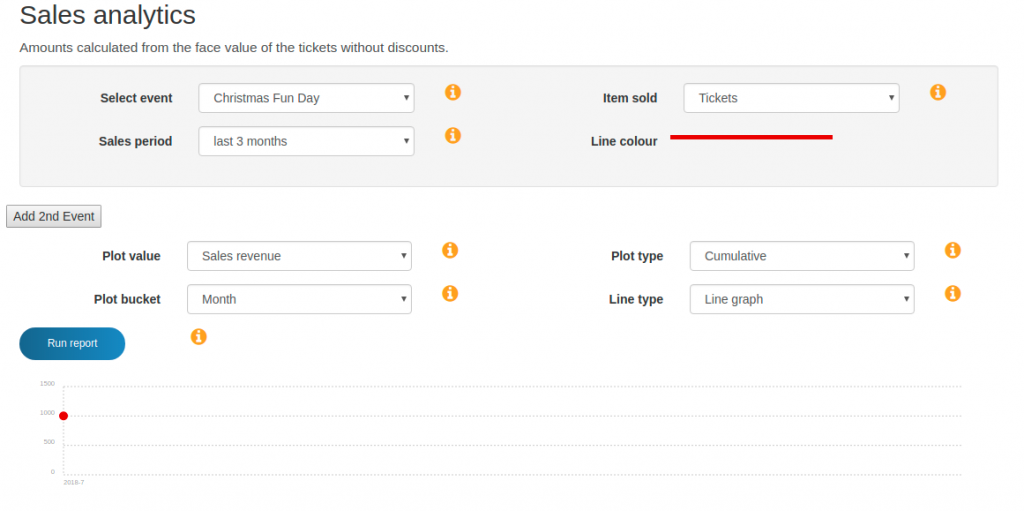
For this particular event there were very few sales in the last 3 months so we only see a single red point instead a graph.
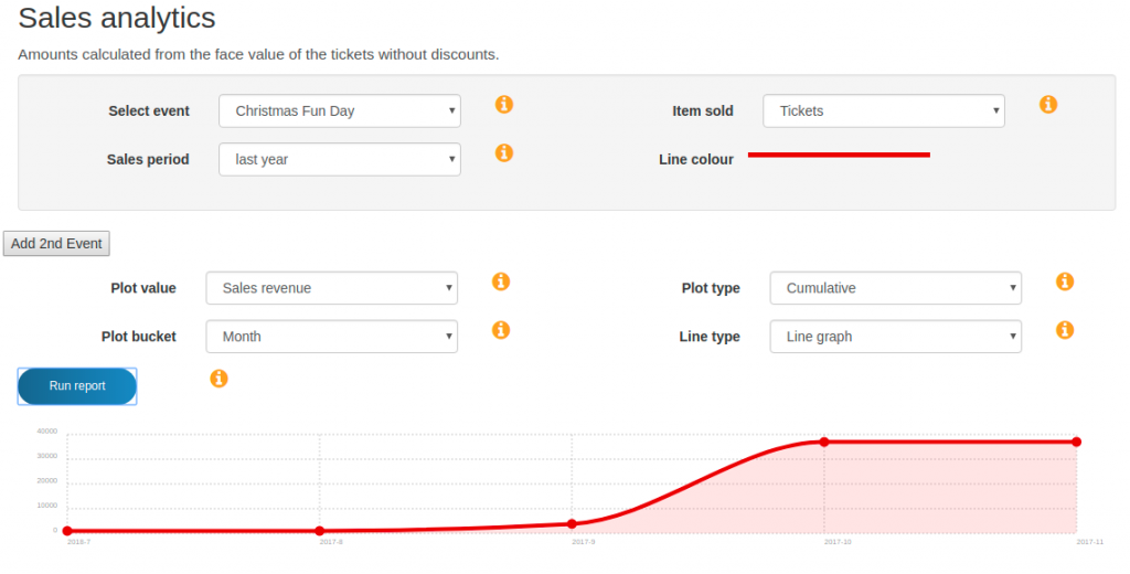
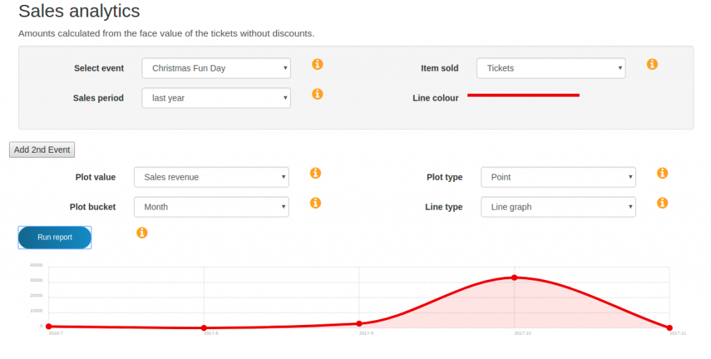
Line graph of sales for the last 12 months
To see a more informative sales graph for this event we need to change the sales period from "last 3 months" to the last 12 months, and click the "Run Report" button. The result is the graph below in which we can see sales increasing towards the end of the year.
Sales Bar Graph
To view this information as a bar graph we can change the "Line type" option from "line graph" to "bar graph" and click "Run Report". The result is shown below.
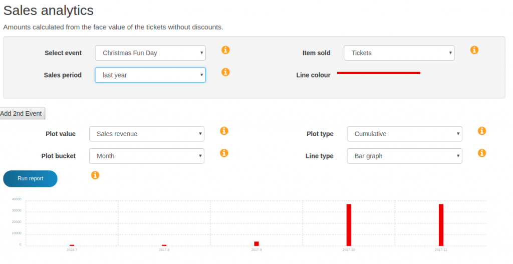
Notice that there are bars in this graph for every month we had sales. This is because the option "Plot bucket" is set to 1 month, if required this can be changed to 1 day or 1 year. Being able to change the bucket is useful if you want to look at the graph over a short period of time (e.g. for a 7 day view we would want 1 day buckets) or over a longer period than 1 year.
Point vs Cumulative
The chart examples so far have been "cumulative" charts, where we see the running total of ever increasing sales. This is useful if we want to see how our sales increased until they reached our final target, but it is less easy to see which periods contributed to those sales. To see the only the sales achieved in each month we change the "Plot type" option from "Cumulative" to "Point" and then run the report. The result for this example can be seen below. With a graph like this we can that sales were at a peak in October and then reduced November before the event.
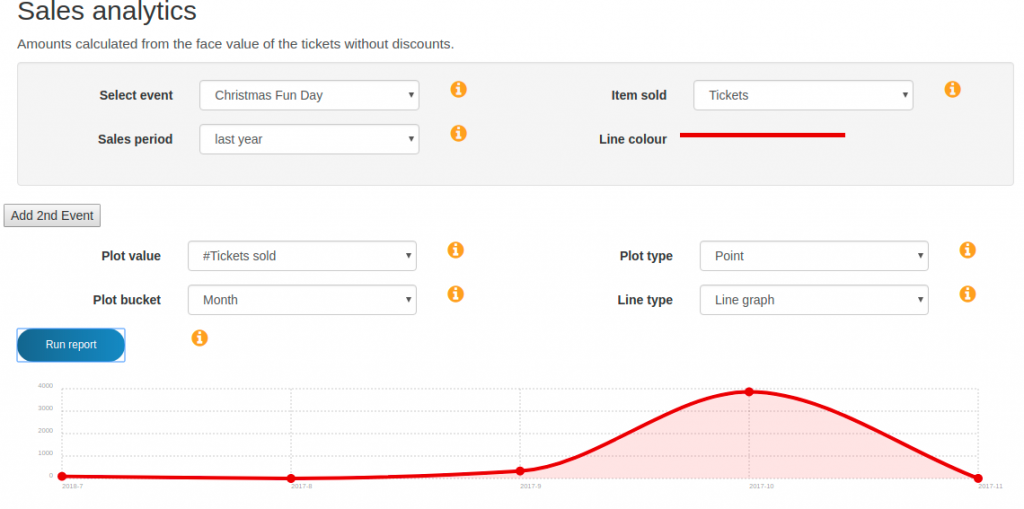
Tickets Sold
The charts so far have displayed sales revenue. However, we might want to see the number of tickets sold rather than revenue. This is possible by changing the "Plot value" option from "sales revenue" to number of tickets sold labelled as "#Tickets sold". When we run the report for our example the resulting chart can be seen in the screenshot below. Notice that the shape of the graph is not that different to the revenue per month chart we last saw (which is expected), however the scale on the chart has changed. We can see that in October approximately 4000 tickets were sold.
Event Schedules and Sales Periods
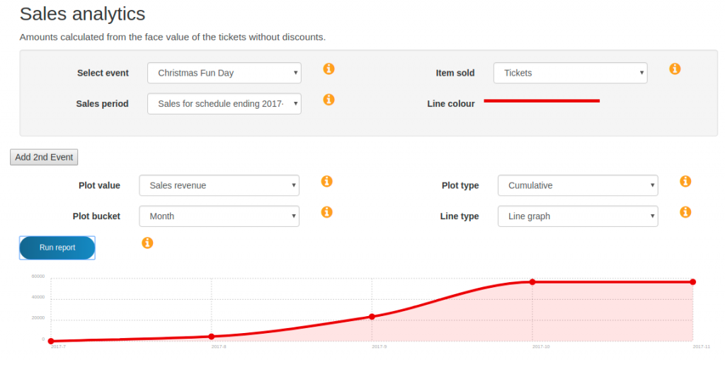
So far we have used absolute time periods of 12 months or 3 months. We also have the option of choosing a complete event schedule. Each event has one or more schedules of dates depending on how many times that same event has been run. Therefore, if we are interested in seeing the sales revenue for one complete occurrence of an event then we can choose the schedule and let the analytics tools choose the start and end date. Doing this for our example event would produce the chart in the screenshot below. Notice that Coconut Tickets has automatically chosen to display sales from July (the first sale) to November (the last sale).
If you need to compare sales from the same event between two different time periods then please see this tutorial.